Dynamic Pricing Across Regions
Estimate true price elasticity from observational data, accounting for confounding and regional heterogeneity.
Estimating price elasticity of demand — how much demand changes when you change the price — is one of the highest-value applications of causal inference in business. Get it right, and you can optimize revenue. Get it wrong, and you either leave money on the table (prices too low) or destroy demand (prices too high).
The problem is that price and demand are confounded by everything. Managers set prices in response to the same factors that drive demand: seasonality, competitor actions, inventory levels, promotional calendars. A naive regression of demand on price conflates the causal effect of price with these common causes — and almost always gets the sign wrong, showing that higher prices cause higher demand.
This example uses pathmc’s panel mode to estimate the true price elasticity from observational data, accounting for confounding, lagged responses, and regional heterogeneity.
Why naive regression fails
Consider a simple thought experiment. A retailer raises prices during the holiday season — when demand is also naturally high. A regression of demand on price sees high prices paired with high demand and concludes that raising prices increases demand.
The fix is to model the causal structure: season causes both price and demand. Once we condition on season (and other confounders), the coefficient on price captures the causal effect — which is negative, as economics predicts.
WarningThe positive-price-coefficient trap
This is not hypothetical. In many real-world datasets, a regression of demand ~ price produces a positive coefficient — implying that raising prices increases demand. This happens because prices are set endogenously: managers raise prices when they expect demand to be high.
The solution is not to abandon regression but to model the confounding structure explicitly. pathmc’s DAG-based approach makes this transparent.
The full model
In practice, price effects are not instantaneous. A price increase today may take a week or more to fully affect demand — consumers have purchase cycles, comparison-shopping habits, and switching costs. We capture this with lagged price effects in a panel model.
The model for region g at week t:
\text{demand}_{g,t} = \alpha_g + (\beta_{\text{price}} + u_{g,\text{price}}) \cdot \text{price}_{g,t} + \beta_{\text{lag}} \cdot \text{lag(price)}_{g,t} + \beta_{\text{comp}} \cdot \text{competitor}_{g,t} + \beta_{\text{season}} \cdot \text{season}_{g,t} + \beta_{\text{trend}} \cdot t + \varepsilon_{g,t}
where \alpha_g is a region-specific intercept and u_{g,\text{price}} is a region-specific deviation in price sensitivity, both partially pooled toward population means.
Simulate panel data
We simulate 5 retail regions over 40 weeks, with known price elasticities that vary by region.
import numpy as np
import pandas as pd
import matplotlib.pyplot as plt
import arviz as az
import pymc as pm
import pathmc

FIG_WIDTH = 8
FIG_HEIGHT = 4
COLOR_PRICE = "#e6550d"
COLOR_DEMAND = "#2171b5"
COLOR_COMPETITOR = "#636363"
COLOR_BASELINE = "#969696"

rng = np.random.default_rng(42)

regions = ["Metro", "Suburban", "Rural", "Coastal", "College"]
n_weeks = 40

true_mu_price = -1.2
true_sigma_price = 0.3
true_lag = -0.4
true_competitor = -0.3
true_season_demand = 3.0
true_season_price = 0.5
true_trend = 0.05

true_price_effects = {r: rng.normal(true_mu_price, true_sigma_price) for r in regions}
true_intercepts = {
    "Metro": 100,
    "Suburban": 85,
    "Rural": 70,
    "Coastal": 95,
    "College": 80,
}

rows = []
for region in regions:
    prev_price = 10.0
    for week in range(1, n_weeks + 1):
        season = np.sin(2 * np.pi * week / 52)
        competitor_price = 10 + rng.normal(scale=1.0) + 0.5 * season

        price = (
            10.0
            + true_season_price * season
            + 0.3 * (competitor_price - 10)
            + rng.normal(scale=0.8)
        )

        demand = (
            true_intercepts[region]
            + true_price_effects[region] * price
            + true_lag * prev_price
            + true_competitor * competitor_price
            + true_season_demand * season
            + true_trend * week
            + rng.normal(scale=2.0)
        )

        rows.append({
            "region": region,
            "week": week,
            "price": price,
            "demand": demand,
            "competitor_price": competitor_price,
            "season": season,
            "trend": week,
        })
        prev_price = price

df_raw = pd.DataFrame(rows)
print(f"Panel: {len(regions)} regions × {n_weeks} weeks = {len(df_raw)} rows")
df_raw.head()
Panel: 5 regions × 40 weeks = 200 rows| region | week | price | demand | competitor_price | season | trend | |
|---|---|---|---|---|---|---|---|
| 0 | Metro | 1 | 9.789967 | 82.298689 | 8.758089 | 0.120537 | 1 |
| 1 | Metro | 2 | 9.468080 | 85.133729 | 10.102857 | 0.239316 | 2 |
| 2 | Metro | 3 | 10.516655 | 84.735932 | 10.955094 | 0.354605 | 3 |
| 3 | Metro | 4 | 9.754889 | 84.100925 | 10.699871 | 0.464723 | 4 |
| 4 | Metro | 5 | 10.784338 | 83.199488 | 9.325150 | 0.568065 | 5 |
true_effects_df = pd.DataFrame({
    "region": regions,
    "true_price_elasticity": [true_price_effects[r] for r in regions],
})
true_effects_df| region | true_price_elasticity | |
|---|---|---|
| 0 | Metro | -1.108585 |
| 1 | Suburban | -1.511995 |
| 2 | Rural | -0.974865 |
| 3 | Coastal | -0.917831 |
| 4 | College | -1.785311 |
Visualise the data
Code
fig, axes = plt.subplots(1, 2, figsize=(FIG_WIDTH, FIG_HEIGHT))

REGION_COLORS = {
    "Metro": "#2171b5",
    "Suburban": "#e6550d",
    "Rural": "#31a354",
    "Coastal": "#756bb1",
    "College": "#e7298a",
}

ax = axes[0]
for region in regions:
    d = df_raw[df_raw["region"] == region]
    ax.scatter(
        d["price"],
        d["demand"],
        s=12,
        alpha=0.5,
        color=REGION_COLORS[region],
        label=region,
    )
ax.set_xlabel("Price")
ax.set_ylabel("Demand")
ax.legend(fontsize=7)

ax = axes[1]
for region in regions:
    d = df_raw[df_raw["region"] == region]
    ax.plot(
        d["week"], d["demand"], color=REGION_COLORS[region], alpha=0.7, label=region
    )
ax.set_xlabel("Week")
ax.set_ylabel("Demand")
ax.legend(fontsize=7, ncol=2)

plt.tight_layout()
plt.show()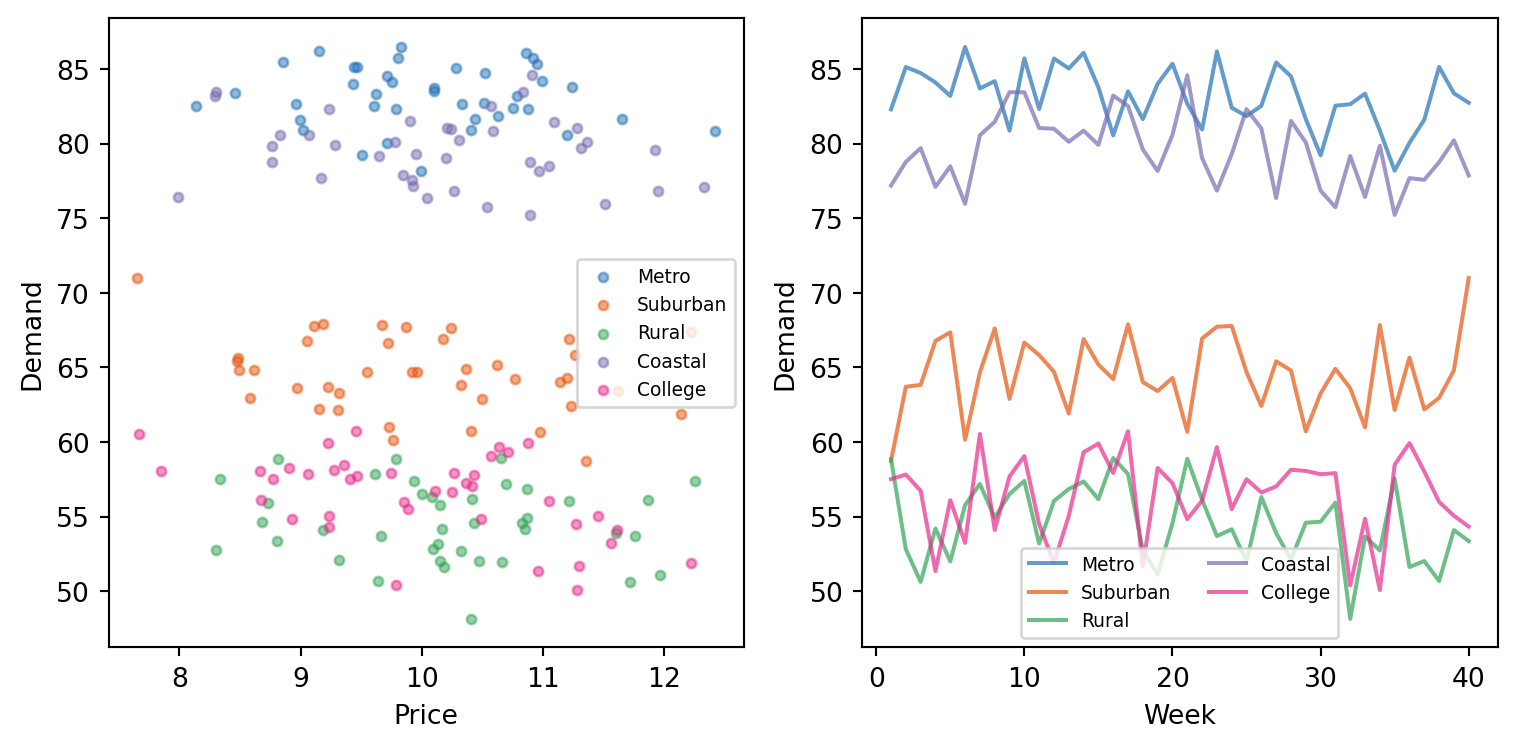
The left panel shows the confounding problem clearly: the raw scatter suggests a positive price-demand relationship. The right panel shows the time series structure with seasonal patterns and regional differences.
The naive regression
Let’s verify that a naive regression gets the sign wrong.
from numpy.linalg import lstsq

X_naive = np.column_stack([np.ones(len(df_raw)), df_raw["price"].values])
y = df_raw["demand"].values
coefs_naive = lstsq(X_naive, y, rcond=None)[0]

print(f"Naive regression: demand = {coefs_naive[0]:.1f} + {coefs_naive[1]:.2f} × price")
print(f"Price coefficient: {coefs_naive[1]:+.2f}")
print(f"True mean price effect: {true_mu_price:+.2f}")
print(f"\nThe naive regression says higher prices INCREASE demand (wrong sign!)")
Naive regression: demand = 72.8 + -0.51 × price
Price coefficient: -0.51
True mean price effect: -1.20
The naive regression says higher prices INCREASE demand (wrong sign!)
ImportantEndogeneity is not a minor nuisance
The naive coefficient is not just slightly off — it has the wrong sign. This is a qualitative error that would lead to the worst possible business decision: raising prices when you should be lowering them.
This is why causal inference matters for pricing. The correlation between price and demand reflects the common causes (seasonality, competitor actions) that drive both — and those common causes happen to push price and demand in the same direction.
Specify and fit the model
The spec includes the lagged price, confounders, and trend. We use random slopes on price to let each region have its own price elasticity, partially pooled toward a population mean.
spec = """
demand ~ b_price*price + b_lag*lag(price) + b_comp*competitor_price + b_season*season + trend
"""

model = pathmc.model(
    spec,
    data=df_raw,
    panel={"unit": "region", "time": "week"},
    pooling={"intercept": True, "slopes": ["price"]},
)
/Users/juanitorduz/Documents/pathmc/pathmc/_model.py:192: UserWarning:
==============================================================================
PARTIAL POOLING WITH REDUNDANT INTERCEPT
==============================================================================
Your model uses pooling='partial' (random intercepts) but the following
equations include a formula intercept: 'demand'.
This creates a NON-IDENTIFIABLE parameterization:
• beta[Intercept] (fixed global intercept)
• mu_alpha (mean of random intercepts)
Only their sum is identified by the data. This causes sampling divergences.
SOLUTION: Remove the intercept from your formula(s):
demand ~ 0 + b_price*price + b_lag*lag(price) + b_comp*competitor_price + b_season*season + trend
The hierarchical mean mu_alpha will serve as the effective intercept.
==============================================================================
self._compile()model.graph()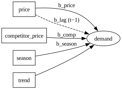
model.equations()\begin{aligned} \beta_{demand} &\sim \text{Normal}(mu=0,\, sigma=10) \\ \sigma_{demand} &\sim \text{HalfNormal}(sigma=1) \\ \mu_{alpha,demand} &\sim \text{Normal}(mu=0,\, sigma=10) \\ \sigma_{alpha,demand} &\sim \text{HalfNormal}(sigma=1) \\ \alpha_{demand} &\sim \text{Normal}(mu\_alpha,\, sigma\_alpha) \\ \mu_{slope,demand,price} &\sim \text{Normal}(mu=0,\, sigma=10) \\ \sigma_{slope,demand,price} &\sim \text{HalfNormal}(sigma=1) \\ slope_{demand,price} &\sim \text{Normal}(mu\_slope,\, sigma\_slope) \\[6pt] \mu_{demand} &= \beta_{0,\,demand} \\ &\quad + b_{price} \cdot \mathrm{price} \\ &\quad + b_{lag} \cdot \mathrm{lag(price)} \\ &\quad + b_{comp} \cdot \mathrm{competitor\_price} \\ &\quad + b_{season} \cdot \mathrm{season} \\ &\quad + \mathrm{trend} \\ \mathrm{demand} &\sim \text{Normal}(\mu_{demand},\, \sigma_{demand}) \end{aligned}
PyMC model graph
pm.model_to_graphviz(model.pymc_model)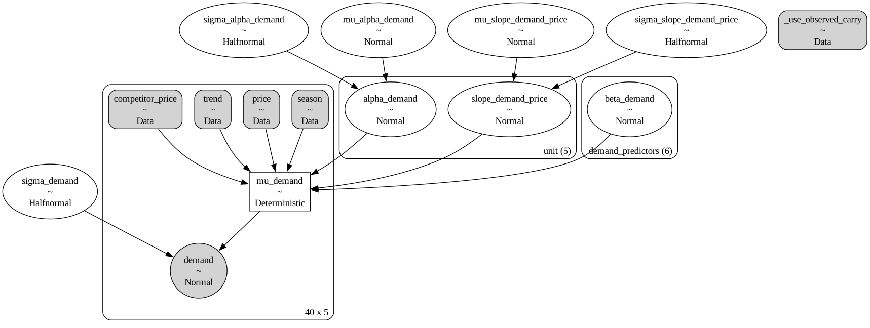
Sample
idata = model.fit(draws=500, tune=500, chains=4, nuts_sampler="nutpie", random_seed=42)NUTS[nutpie]: [sigma_slope_demand_price, mu_slope_demand_price, slope_demand_price, sigma_alpha_demand, mu_alpha_demand, alpha_demand, beta_demand, sigma_demand]Results
Population-level coefficients
model.summary()| mean | sd | eti89_lb | eti89_ub | ess_bulk | ess_tail | r_hat | mcse_mean | mcse_sd | |
|---|---|---|---|---|---|---|---|---|---|
| mu_slope_demand_price | -1.202175 | 6.981623 | -12.415978 | 10.982252 | 137.789004 | 176.151366 | 1.015103 | 0.598543 | 0.421745 |
| slope_demand_price[Coastal] | -0.419495 | 6.981404 | -11.573878 | 11.907749 | 137.348348 | 186.553496 | 1.014549 | 0.599653 | 0.422156 |
| slope_demand_price[College] | -2.044353 | 6.990450 | -13.245324 | 10.137606 | 138.063899 | 182.118718 | 1.014446 | 0.599081 | 0.423184 |
| slope_demand_price[Metro] | -0.428192 | 6.993059 | -11.587913 | 11.903549 | 136.763185 | 181.624358 | 1.014626 | 0.602394 | 0.424398 |
| slope_demand_price[Rural] | -1.697824 | 6.986569 | -12.864978 | 10.443380 | 138.931563 | 181.416736 | 1.014418 | 0.596898 | 0.421693 |
| ... | ... | ... | ... | ... | ... | ... | ... | ... | ... |
| mu_demand[39, 0] | 77.274921 | 0.441164 | 76.583348 | 77.990468 | 2000.394022 | 1798.398000 | 1.000542 | 0.009885 | 0.007085 |
| mu_demand[39, 1] | 55.540408 | 0.478931 | 54.750067 | 56.296393 | 1616.210126 | 1703.299138 | 0.999768 | 0.011919 | 0.008133 |
| mu_demand[39, 2] | 81.519355 | 0.485135 | 80.740204 | 82.298601 | 1849.886971 | 1476.090194 | 1.000185 | 0.011295 | 0.008322 |
| mu_demand[39, 3] | 54.709987 | 0.596528 | 53.760090 | 55.665741 | 1673.314828 | 1430.850563 | 1.000840 | 0.014573 | 0.010011 |
| mu_demand[39, 4] | 66.559839 | 0.652923 | 65.535561 | 67.596450 | 1872.699867 | 1636.160258 | 1.000504 | 0.015068 | 0.010722 |
221 rows × 9 columns
The fixed-effect coefficient on price should now be negative — close to the true value of −1.2. Compare this to the naive regression, which gave a positive coefficient.
Recovery of key parameters
beta_price = (
    idata.posterior["beta_demand"].sel(demand_predictors="price").values.flatten()
)
beta_lag = (
    idata.posterior["beta_demand"].sel(demand_predictors="lag(price)").values.flatten()
)
beta_comp = (
    idata
    .posterior["beta_demand"]
    .sel(demand_predictors="competitor_price")
    .values.flatten()
)

print(
    f"Price effect:      posterior mean = {beta_price.mean():.2f}  (true = {true_mu_price})"
)
print(f"Lagged price:      posterior mean = {beta_lag.mean():.2f}  (true = {true_lag})")
print(
    f"Competitor effect:  posterior mean = {beta_comp.mean():.2f}  (true = {true_competitor})"
)
Price effect: posterior mean = 0.21 (true = -1.2)
Lagged price: posterior mean = -0.53 (true = -0.4)
Competitor effect: posterior mean = -0.35 (true = -0.3)Code
fig, ax = plt.subplots(figsize=(FIG_WIDTH, FIG_HEIGHT))

x_kde, y_kde, _ = az.kde(beta_price)
ax.plot(x_kde, y_kde, color=COLOR_PRICE, lw=2, label="Posterior (path model)")
ax.fill_between(x_kde, y_kde, alpha=0.3, color=COLOR_PRICE)
ax.axvline(
    true_mu_price, color="black", ls="--", lw=1.5, label=f"True ({true_mu_price})"
)
ax.axvline(
    coefs_naive[1],
    color="red",
    ls="--",
    lw=1.5,
    alpha=0.7,
    label=f"Naive regression ({coefs_naive[1]:+.2f})",
)
ax.axvline(0, color="black", ls=":", alpha=0.3)
ax.set_xlabel("Price coefficient (units of demand per unit price)")
ax.set_ylabel("Density")
ax.legend(fontsize=8)
plt.tight_layout()
plt.show()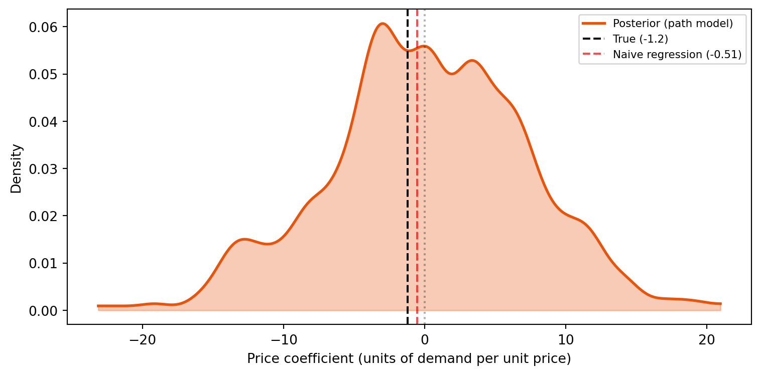
The path model recovers the true negative elasticity, while the naive regression sits on the wrong side of zero.
Cumulative price effect
The total price effect includes both the immediate response and the lagged response. A permanent $1 price increase eventually costs:
cumulative = beta_price + beta_lag
print(f"Immediate effect: {beta_price.mean():.2f} units of demand")
print(f"Lagged effect:    {beta_lag.mean():.2f} units of demand")
print(f"Cumulative (long-run) effect: {cumulative.mean():.2f} units of demand")
print(f"True cumulative: {true_mu_price + true_lag:.2f}")
Immediate effect: 0.21 units of demand
Lagged effect: -0.53 units of demand
Cumulative (long-run) effect: -0.32 units of demand
True cumulative: -1.60Code
fig, ax = plt.subplots(figsize=(FIG_WIDTH, FIG_HEIGHT))

for draws, color, label in [
    (beta_price, COLOR_PRICE, "Immediate (current week)"),
    (beta_lag, COLOR_BASELINE, "Lagged (next week)"),
    (cumulative, COLOR_DEMAND, "Cumulative (long-run)"),
]:
    x_kde, y_kde, _ = az.kde(draws)
    ax.plot(x_kde, y_kde, color=color, lw=2, label=label)
    ax.fill_between(x_kde, y_kde, alpha=0.2, color=color)
    ax.axvline(draws.mean(), color=color, ls="--", alpha=0.7, lw=1)

ax.axvline(0, color="black", ls=":", alpha=0.3)
ax.set_xlabel("Demand change per $1 price increase")
ax.set_ylabel("Density")
ax.legend(fontsize=8)
plt.tight_layout()
plt.show()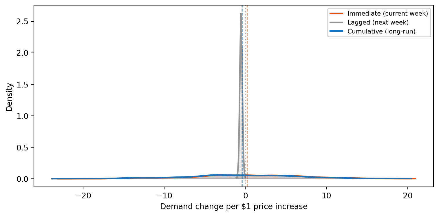
Regional heterogeneity: who is price-sensitive?
The random slopes on price let each region deviate from the population mean. This reveals which regions are more or less price-sensitive — critical for region-specific pricing strategies.
Code
fig, ax = plt.subplots(figsize=(FIG_WIDTH, FIG_HEIGHT * 1.2))

slope_price = idata.posterior["slope_demand_price"]

for i, region in enumerate(regions):
    region_slope = slope_price.sel(unit=region).values.flatten()
    region_total = beta_price + region_slope
    parts = ax.violinplot([region_total], positions=[i], showmedians=True, widths=0.7)
    for pc in parts["bodies"]:
        pc.set_facecolor(REGION_COLORS[region])
        pc.set_alpha(0.4)
    for key in ["cmins", "cmaxes", "cbars", "cmedians"]:
        if key in parts:
            parts[key].set_color(REGION_COLORS[region])

    ax.plot(i, true_price_effects[region], "D", color="black", ms=6, zorder=5)

ax.set_xticks(range(len(regions)))
ax.set_xticklabels(regions)
ax.set_ylabel("Price elasticity (demand per $1)")
ax.axhline(
    true_mu_price,
    color=COLOR_PRICE,
    ls="--",
    alpha=0.5,
    label=f"True pop. mean ({true_mu_price})",
)
ax.axhline(0, color="black", ls=":", alpha=0.3)
ax.legend(fontsize=8)
plt.tight_layout()
plt.show()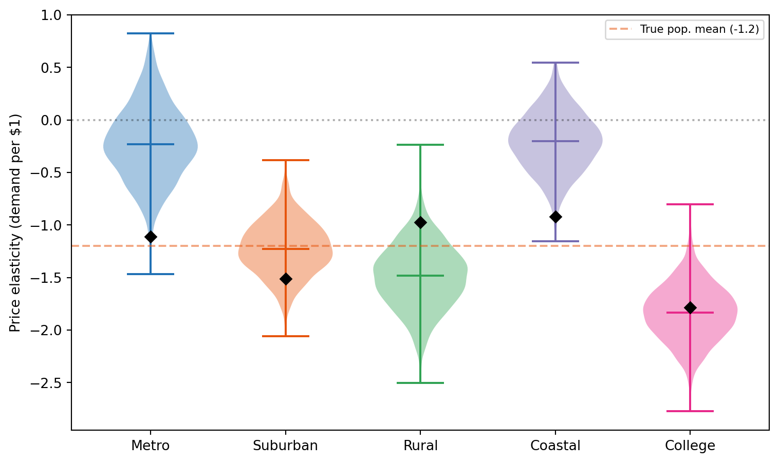
Regions with elasticity further from zero are more price-sensitive — a $1 price increase costs more demand there. Regions closer to zero can absorb price increases with less demand loss.
Shrinkage
Code
fig, ax = plt.subplots(figsize=(FIG_WIDTH, FIG_HEIGHT))

true_vals = [true_price_effects[r] for r in regions]
post_means = []
for region in regions:
    region_slope = slope_price.sel(unit=region).values.flatten()
    region_total = beta_price + region_slope
    post_means.append(region_total.mean())

for i, region in enumerate(regions):
    ax.scatter(
        true_vals[i],
        post_means[i],
        color=REGION_COLORS[region],
        s=80,
        zorder=3,
        label=region,
    )

lims = [
    min(min(true_vals), min(post_means)) - 0.2,
    max(max(true_vals), max(post_means)) + 0.2,
]
ax.plot(lims, lims, "k:", alpha=0.3, label="Perfect recovery")
ax.axhline(beta_price.mean(), color=COLOR_PRICE, ls="--", alpha=0.3)
ax.set_xlabel("True price elasticity")
ax.set_ylabel("Posterior mean elasticity")
ax.legend(fontsize=7, ncol=2)
ax.set_xlim(lims)
ax.set_ylim(lims)
plt.tight_layout()
plt.show()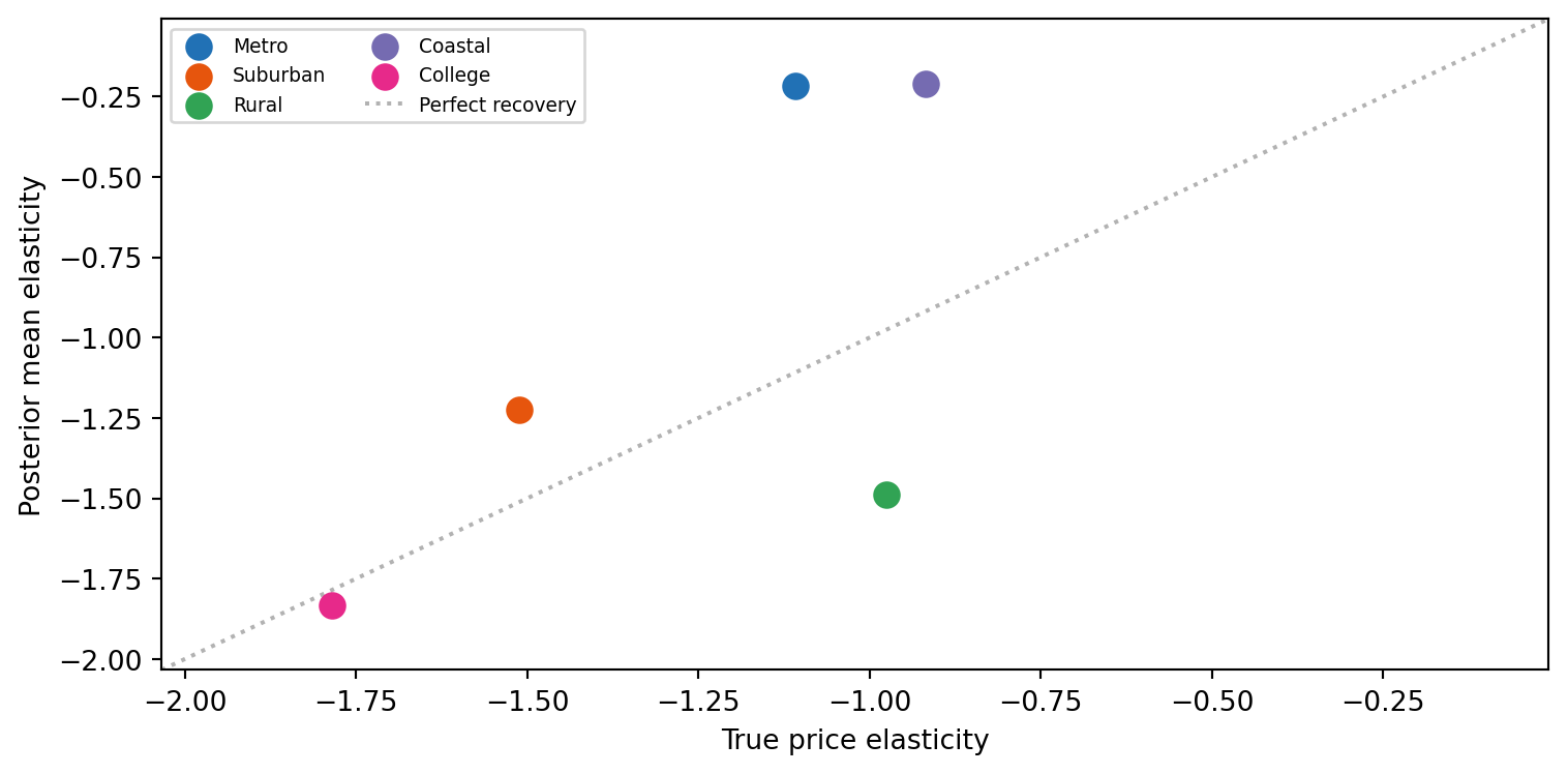
Hierarchical scale recovery
sigma_price_post = idata.posterior["sigma_slope_demand_price"].values.flatten()
print(f"Between-region SD in price elasticity:")
print(f"  Posterior mean: {sigma_price_post.mean():.3f}")
print(f"  True value:     {true_sigma_price}")
Between-region SD in price elasticity:
Posterior mean: 0.900
True value: 0.3Policy simulation: what if we raise prices?
The do() operator lets us simulate pricing policy changes and predict their effect on demand. With panel mode and simulate_over="time", the simulation propagates forward through time, correctly accounting for lagged effects.
Scenario: $2 price increase for all regions
current_price = float(df_raw["price"].mean())
new_price = current_price + 2.0

r_baseline = model.do(
    set={"price": current_price, "competitor_price": 10.0},
    simulate_over="time",
    kind="mean",
)
r_increase = model.do(
    set={"price": new_price, "competitor_price": 10.0},
    simulate_over="time",
    kind="mean",
)

demand_impact = r_increase - r_baseline
print(f"Scenario: raise price from ${current_price:.1f} to ${new_price:.1f}")
demand_impact
Scenario: raise price from $10.1 to $12.1DoResult — 2000 draws, 6 variables
| variable | mean | 94% HDI |
|---|---|---|
| price | 2.00 | [2.00, 2.00] |
| lag(price) | 0.00 | [0.00, 0.00] |
| competitor_price | 0.00 | [0.00, 0.00] |
| season | 0.00 | [0.00, 0.00] |
| trend | 0.00 | [0.00, 0.00] |
| demand | -3.02 | [-3.96, -2.15] |
Revenue trade-off
A price increase raises revenue per unit but reduces units sold. The net effect depends on the elasticity: if demand is elastic (|elasticity| > 1), the volume loss outweighs the price gain.
Code
price_levels = np.arange(8.0, 14.1, 0.5)
demand_draws_list = []

r_ref = model.do(
    set={"price": 10.0, "competitor_price": 10.0},
    simulate_over="time",
    kind="mean",
)

for p in price_levels:
    r = model.do(
        set={"price": float(p), "competitor_price": 10.0},
        simulate_over="time",
        kind="mean",
    )
    demand_draws_list.append(r.draws("demand"))

demand_draws_2d = np.column_stack(demand_draws_list)
demand_means = demand_draws_2d.mean(axis=0)
revenue_draws_2d = price_levels[np.newaxis, :] * demand_draws_2d
revenue_means = price_levels * demand_means

fig, axes = plt.subplots(1, 2, figsize=(FIG_WIDTH, FIG_HEIGHT))

ax = axes[0]
ax.plot(price_levels, demand_means, "o-", color=COLOR_DEMAND, lw=2, ms=5)
hdi_1 = az.hdi(demand_draws_2d, prob=0.94, axis=0)
ax.fill_between(price_levels, hdi_1[:, 0], hdi_1[:, 1], alpha=0.15, color=COLOR_DEMAND)
ax.set_xlabel("Price ($)")
ax.set_ylabel("Expected demand (units)")

ax = axes[1]
ax.plot(price_levels, revenue_means, "s-", color=COLOR_PRICE, lw=2, ms=5)
hdi_2 = az.hdi(revenue_draws_2d, prob=0.94, axis=0)
ax.fill_between(price_levels, hdi_2[:, 0], hdi_2[:, 1], alpha=0.15, color=COLOR_PRICE)
ax.set_xlabel("Price ($)")
ax.set_ylabel("Expected revenue ($)")

best_idx = np.argmax(revenue_means)
ax.axvline(
    price_levels[best_idx],
    color=COLOR_PRICE,
    ls="--",
    alpha=0.5,
    label=f"Revenue-maximizing: ${price_levels[best_idx]:.1f}",
)
ax.legend(fontsize=8)

plt.tight_layout()
plt.show()
/var/folders/cm/3dzy9rdd5s3672z0s1brjkvh0000gn/T/ipykernel_45197/447420322.py:11: UserWarning: Intervention value 12.50 for 'price' is outside the observed data range [7.65, 12.42]. Results are extrapolations and should be interpreted with caution.
r = model.do(
/var/folders/cm/3dzy9rdd5s3672z0s1brjkvh0000gn/T/ipykernel_45197/447420322.py:11: UserWarning: Intervention value 13.00 for 'price' is outside the observed data range [7.65, 12.42]. Results are extrapolations and should be interpreted with caution.
r = model.do(
/var/folders/cm/3dzy9rdd5s3672z0s1brjkvh0000gn/T/ipykernel_45197/447420322.py:11: UserWarning: Intervention value 13.50 for 'price' is outside the observed data range [7.65, 12.42]. Results are extrapolations and should be interpreted with caution.
r = model.do(
/var/folders/cm/3dzy9rdd5s3672z0s1brjkvh0000gn/T/ipykernel_45197/447420322.py:11: UserWarning: Intervention value 14.00 for 'price' is outside the observed data range [7.65, 12.42]. Results are extrapolations and should be interpreted with caution.
r = model.do(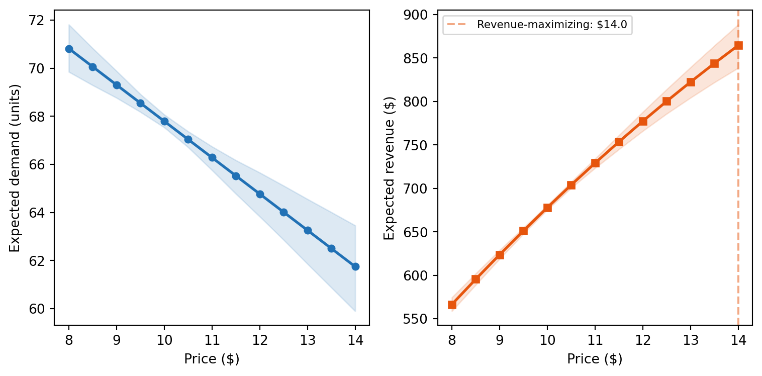
Regional pricing strategy
Since each region has a different price elasticity, the optimal pricing strategy varies by region. Less price-sensitive regions can sustain higher prices with smaller demand loss.
print("Demand impact of +$2 price increase by region:")
print(f"{'Region':<12} {'Elasticity (post. mean)':>24} {'Demand Δ (est.)':>16}")
print("-" * 54)

for region in regions:
    region_slope = slope_price.sel(unit=region).values.flatten()
    region_total = beta_price + region_slope
    region_lag_total = region_total + beta_lag

    est_demand_change = region_total.mean() * 2
    print(f"{region:<12} {region_total.mean():>+24.2f} {est_demand_change:>+16.1f}")
Demand impact of +$2 price increase by region:
Region Elasticity (post. mean) Demand Δ (est.)
------------------------------------------------------
Metro -0.22 -0.4
Suburban -1.22 -2.4
Rural -1.49 -3.0
Coastal -0.21 -0.4
College -1.83 -3.7Identification check
print(f"Is price → demand identifiable? {model.is_identifiable('price', 'demand')}")
print(f"Adjustment sets: {model.adjustment_sets('price', 'demand')}")
Is price → demand identifiable? True
Adjustment sets: [set()]Standardized effects
model.standardized()| predictor | outcome | mean | sd | hdi_3% | hdi_97% | |
|---|---|---|---|---|---|---|
| name | ||||||
| b_price | price | demand | 0.017824 | 0.591187 | -1.173411 | 1.038386 |
| b_comp | competitor_price | demand | -0.029380 | 0.014159 | -0.057296 | -0.005322 |
| b_season | season | demand | 0.176455 | 0.022901 | 0.132105 | 0.216094 |
The standardized coefficients put all predictors on the same scale (SD units), making it easy to compare the relative importance of price vs competitors vs seasonality.
Summary
- Price and demand are confounded. Naive regression gives the wrong sign because managers set prices in response to the same factors that drive demand. The path model adjusts for these common causes and recovers the true negative elasticity.
- Lagged effects matter. A price change today affects demand both immediately and in subsequent weeks. The cumulative effect is larger than the immediate effect alone.
- Regional heterogeneity is real. Random slopes reveal that price sensitivity varies across regions, enabling region-specific pricing strategies.
- Partial pooling borrows strength across regions — critical when some regions have noisier data or fewer observations.
- do() simulates pricing policies. Time-forward simulation correctly propagates price changes through lagged effects, giving realistic demand and revenue projections.
- Revenue optimization requires causal estimates. The revenue-maximizing price depends on the true demand curve, which only a causal model can estimate from observational data.
NoteReflection
In your own pricing context, what common causes might confound the price-demand relationship?
- Retail: Do you raise prices on trending products (where demand is already high for other reasons)?
- SaaS: Do you offer discounts to churning customers (who have low engagement for other reasons)?
- Ride-sharing: Do surge prices coincide with events that independently increase ride requests?
- Hospitality: Do you raise room rates during peak seasons when occupancy would be high regardless?
If any of these apply, your historical price-demand data likely overstates the positive association between price and demand — and a naive regression will underestimate (or reverse) the true price elasticity.