Difference-in-Differences
Estimate treatment effects by comparing changes over time between treated and control groups using panel mode.
Difference-in-differences (DiD) estimates a treatment effect by comparing changes over time between a treated group and a control group. pathmc’s panel mode fits this naturally: the structural model captures group and time effects, and the do() operator estimates the average treatment effect on the treated (ATT).
The causal structure
We model an outcome Y as a function of treatment group membership (treated), a continuous time trend (time), and a treatment activation indicator (treat_post).
treated: 1 for the treatment group, 0 for controltime: the time period (continuous), capturing the underlying trend shared by both groupstreat_post: the DiD interaction term (1 only for treated units after treatment)
Including time as a continuous predictor lets the model capture the underlying trend, so the treatment effect is identified as a level shift relative to that trend — the standard DiD design.
Simulate panel data
We generate data for 6 units (3 treated, 3 control) observed over 20 time periods. Treatment starts at period 11, with a true ATT of 2.0.
import numpy as np
import pandas as pd
import matplotlib.pyplot as plt
import arviz as az
import pathmc

rng = np.random.default_rng(42)

units_treated = ["T1", "T2", "T3"]
units_control = ["C1", "C2", "C3"]
all_units = units_treated + units_control
n_periods = 20
treatment_start = 11
true_att = 2.0

true_unit_effects = {
    "T1": 3.0,
    "T2": 4.0,
    "T3": 5.0,
    "C1": 2.0,
    "C2": 3.5,
    "C3": 4.5,
}

rows = []
for unit in all_units:
    is_treated = 1 if unit in units_treated else 0
    for t in range(1, n_periods + 1):
        post = 1 if t >= treatment_start else 0
        treat_post = is_treated * post
        y = (
            true_unit_effects[unit]
            + 0.3 * t
            + true_att * treat_post
            + rng.normal(scale=0.5)
        )
        rows.append({
            "unit": unit,
            "time": t,
            "treated": is_treated,
            "post": post,
            "treat_post": treat_post,
            "Y": y,
        })

df = pd.DataFrame(rows)
df.head(10)| unit | time | treated | post | treat_post | Y | |
|---|---|---|---|---|---|---|
| 0 | T1 | 1 | 1 | 0 | 0 | 3.452359 |
| 1 | T1 | 2 | 1 | 0 | 0 | 3.080008 |
| 2 | T1 | 3 | 1 | 0 | 0 | 4.275226 |
| 3 | T1 | 4 | 1 | 0 | 0 | 4.670282 |
| 4 | T1 | 5 | 1 | 0 | 0 | 3.524482 |
| 5 | T1 | 6 | 1 | 0 | 0 | 4.148910 |
| 6 | T1 | 7 | 1 | 0 | 0 | 5.163920 |
| 7 | T1 | 8 | 1 | 0 | 0 | 5.241879 |
| 8 | T1 | 9 | 1 | 0 | 0 | 5.691599 |
| 9 | T1 | 10 | 1 | 0 | 0 | 5.573478 |
Visualise the raw data
fig, ax = plt.subplots(figsize=(8, 4))
for unit in units_treated:
    d = df[df["unit"] == unit]
    ax.plot(d["time"], d["Y"], color="steelblue", alpha=0.6)
for unit in units_control:
    d = df[df["unit"] == unit]
    ax.plot(d["time"], d["Y"], color="coral", alpha=0.6)

ax.axvline(treatment_start - 0.5, ls="--", color="gray", label="Treatment onset")
ax.plot([], [], color="steelblue", label="Treated")
ax.plot([], [], color="coral", label="Control")
ax.set_xlabel("Time")
ax.set_ylabel("Y")
ax.legend()
ax.set_title("Raw outcome trajectories")
plt.tight_layout()
plt.show()
Specify and fit the model
We use panel mode with partial pooling (random intercepts per unit) to account for baseline differences.
spec = "Y ~ treated + time + treat_post"

model = pathmc.model(
    spec,
    data=df,
    panel={"unit": "unit", "time": "time"},
    pooling="partial",
)
model.graph()
/Users/benjamv/git/copilot-worktrees/pathmc/drbenvincent-literate-couscous/pathmc/_model.py:165: UserWarning:
==============================================================================
PARTIAL POOLING WITH REDUNDANT INTERCEPT
==============================================================================
Your model uses pooling='partial' (random intercepts) but the following
equations include a formula intercept: 'Y'.
This creates a NON-IDENTIFIABLE parameterization:
• beta[Intercept] (fixed global intercept)
• mu_alpha (mean of random intercepts)
Only their sum is identified by the data. This causes sampling divergences.
SOLUTION: Remove the intercept from your formula(s):
Y ~ 0 + treated + time + treat_post
The hierarchical mean mu_alpha will serve as the effective intercept.
==============================================================================
self._compile()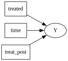
model.equations()\begin{aligned} \beta_{Y} &\sim \text{Normal}(mu=0,\, sigma=10) \\ \sigma_{Y} &\sim \text{HalfNormal}(sigma=1) \\ \mu_{alpha,Y} &\sim \text{Normal}(mu=0,\, sigma=10) \\ \sigma_{alpha,Y} &\sim \text{HalfNormal}(sigma=1) \\ \alpha_{Y} &\sim \text{Normal}(mu\_alpha,\, sigma\_alpha) \\[6pt] \mu_{Y} &= \beta_{0,\,Y} \\ &\quad + \mathrm{treated} \\ &\quad + \mathrm{time} \\ &\quad + \mathrm{treat\_post} \\ \mathrm{Y} &\sim \text{Normal}(\mu_{Y},\, \sigma_{Y}) \end{aligned}
Sample
idata = model.fit(draws=500, tune=500, chains=4, random_seed=42)NUTS[nutpie]: [sigma_alpha_Y, mu_alpha_Y, alpha_Y, beta_Y, sigma_Y]Results
The coefficient on treat_post is our estimate of the ATT.
model.summary()| mean | sd | eti89_lb | eti89_ub | ess_bulk | ess_tail | r_hat | mcse_mean | mcse_sd | |
|---|---|---|---|---|---|---|---|---|---|
| mu_alpha_Y | 0.929265 | 6.908334 | -10.152029 | 12.959553 | 134.107378 | 102.867621 | 1.035566 | 0.612339 | 0.453007 |
| alpha_Y[C1] | -0.337403 | 6.873656 | -11.654975 | 11.329493 | 133.786605 | 102.304290 | 1.035521 | 0.613175 | 0.455878 |
| alpha_Y[C2] | 1.025957 | 6.873566 | -10.234248 | 12.764077 | 134.751931 | 103.299586 | 1.035323 | 0.611370 | 0.453810 |
| alpha_Y[C3] | 2.138663 | 6.872826 | -9.109261 | 13.835504 | 134.763080 | 102.484195 | 1.035316 | 0.611050 | 0.453907 |
| alpha_Y[T1] | -0.089404 | 6.973283 | -11.326207 | 12.031987 | 134.053111 | 96.386881 | 1.034796 | 0.616906 | 0.459386 |
| ... | ... | ... | ... | ... | ... | ... | ... | ... | ... |
| mu_Y[115] | 9.212798 | 0.099721 | 9.049495 | 9.375003 | 1842.938719 | 1627.741869 | 1.002631 | 0.002328 | 0.001673 |
| mu_Y[116] | 9.508284 | 0.103344 | 9.339369 | 9.676704 | 1769.329162 | 1587.038596 | 1.001987 | 0.002460 | 0.001766 |
| mu_Y[117] | 9.803770 | 0.107397 | 9.630790 | 9.978529 | 1696.064032 | 1684.699444 | 1.002181 | 0.002605 | 0.001865 |
| mu_Y[118] | 10.099256 | 0.111831 | 9.920617 | 10.279573 | 1639.669818 | 1674.574652 | 1.002021 | 0.002761 | 0.001972 |
| mu_Y[119] | 10.394742 | 0.116605 | 10.208952 | 10.583154 | 1568.514086 | 1632.698217 | 1.002074 | 0.002925 | 0.002083 |
133 rows × 9 columns
Posterior distribution of the ATT
The coefficient on treat_post is the ATT. We can visualise its full posterior distribution and compare it to the true value used in the simulation.
az.plot_dist(
    idata,
    var_names=["beta_Y"],
    coords={"Y_predictors": ["treat_post"]},
    ci_kind="hdi",
    ci_prob=0.94,
    visuals={"title": False, "point_estimate_text": False},
    figure_kwargs={"figsize": (8, 3)},
)
plt.gca().axvline(true_att, color="k", ls="--", lw=1.5)
plt.tight_layout()
plt.show()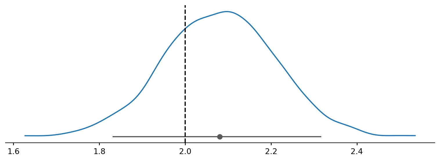
Causal effect via do()
We can also estimate the ATT using the do() operator by comparing outcomes with and without treatment.
r_treated = model.do(set={"treat_post": 1.0, "treated": 1.0, "time": 15.0})
r_control = model.do(set={"treat_post": 0.0, "treated": 1.0, "time": 15.0})

att = r_treated - r_control
att
DoResult — 2000 draws, 4 variables
| variable | mean | 94% HDI |
|---|---|---|
| treated | 0.00 | [0.00, 0.00] |
| time | 0.00 | [0.00, 0.00] |
| treat_post | 1.00 | [1.00, 1.00] |
| Y | 2.08 | [1.83, 2.32] |
The posterior mean should be close to the true ATT of 2.0.
Model predictions and counterfactual
With time as a continuous predictor, the model fits trend lines through each group. The counterfactual extrapolates the treated group’s pre-treatment trend forward — the gap between the counterfactual and the actual treated fit is the ATT.
stacked = idata.posterior.to_dataset().stack(sample=("chain", "draw"))
beta = stacked["beta_Y"]
alpha_draws = stacked["alpha_Y"]

b0 = beta.sel(Y_predictors="Intercept").values
b_treated = beta.sel(Y_predictors="treated").values
b_time = beta.sel(Y_predictors="time").values
b_tp = beta.sel(Y_predictors="treat_post").values


def group_mu(units, t, treat_post_val):
    """Posterior draws of group-averaged mu at a single time point."""
    preds = []
    for u in units:
        alpha_u = alpha_draws.sel(unit=u).values
        is_treated = 1.0 if u in units_treated else 0.0
        mu = b0 + alpha_u + b_treated * is_treated + b_time * t + b_tp * treat_post_val
        preds.append(mu)
    return np.mean(preds, axis=0)


times = np.arange(1, n_periods + 1, dtype=float)

treated_fit = np.array([
    group_mu(units_treated, t, 1.0 if t >= treatment_start else 0.0).mean()
    for t in times
])
treated_cf = np.array([group_mu(units_treated, t, 0.0).mean() for t in times])
control_fit = np.array([group_mu(units_control, t, 0.0).mean() for t in times])

fig, ax = plt.subplots(figsize=(9, 5))

treated_obs = df[df["treated"] == 1].groupby("time")["Y"].mean()
control_obs = df[df["treated"] == 0].groupby("time")["Y"].mean()
ax.scatter(
    treated_obs.index,
    treated_obs.values,
    color="steelblue",
    alpha=0.4,
    s=25,
    zorder=5,
    label="Treated (observed)",
)
ax.scatter(
    control_obs.index,
    control_obs.values,
    color="coral",
    alpha=0.4,
    s=25,
    zorder=5,
    label="Control (observed)",
)

ax.plot(times, treated_fit, color="steelblue", lw=2.5, label="Treated (fitted)")
ax.plot(times, control_fit, color="coral", lw=2.5, label="Control (fitted)")
ax.plot(
    times,
    treated_cf,
    color="steelblue",
    ls="--",
    lw=2,
    label="Treated (counterfactual)",
)

post_mask = times >= treatment_start
ax.fill_between(
    times[post_mask],
    treated_cf[post_mask],
    treated_fit[post_mask],
    color="steelblue",
    alpha=0.15,
    label="Causal effect (ATT)",
)

ax.axvline(treatment_start - 0.5, ls=":", color="gray", alpha=0.7)
ax.annotate(
    "Treatment onset",
    xy=(treatment_start - 0.5, ax.get_ylim()[1]),
    fontsize=9,
    color="gray",
    ha="right",
    xytext=(treatment_start - 1, ax.get_ylim()[1] - 0.3),
)

ax.set_xlabel("Time")
ax.set_ylabel("Y")
ax.set_title("Difference-in-Differences: observed, fitted, and counterfactual")
ax.legend(loc="upper left", fontsize=8, framealpha=0.9)
plt.tight_layout()
plt.show()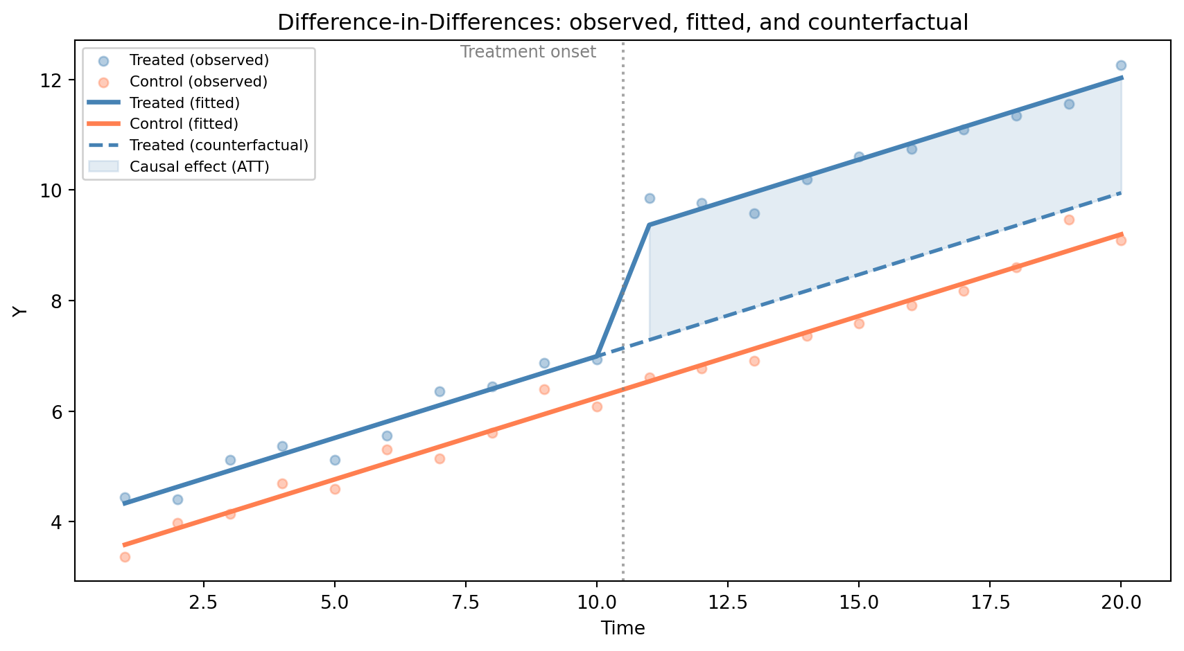
The solid lines show the model’s fitted trends for each group. Pre-treatment, the treated fit and counterfactual overlap — confirming parallel trends. Post-treatment, the dashed line continues the treated group’s trend without treatment, and the shaded gap is the estimated ATT (\approx 2.0).