Model seasonal variation with the fourier() basis term and inspect its harmonic components.
Author
Benjamin Vincent
Weekly sales can rise and fall every year without changing abruptly at the boundary between weeks 52 and 1. A week-by-week categorical effect can describe that pattern, but it needs one parameter per week and does not express its smooth, repeating structure. fourier(week, n=3, period=52) instead represents a yearly cycle with three sine/cosine harmonic pairs, each with its own coefficient.
This example simulates two years of sales, fits a seasonal model, and checks that posterior-predictive sales recover the planted cycle and its observation noise. It assumes familiarity with fitting a basic pathmc model; see the Basis Terms guide for how Fourier and HSGP terms differ.
Simulate a repeating seasonal signal
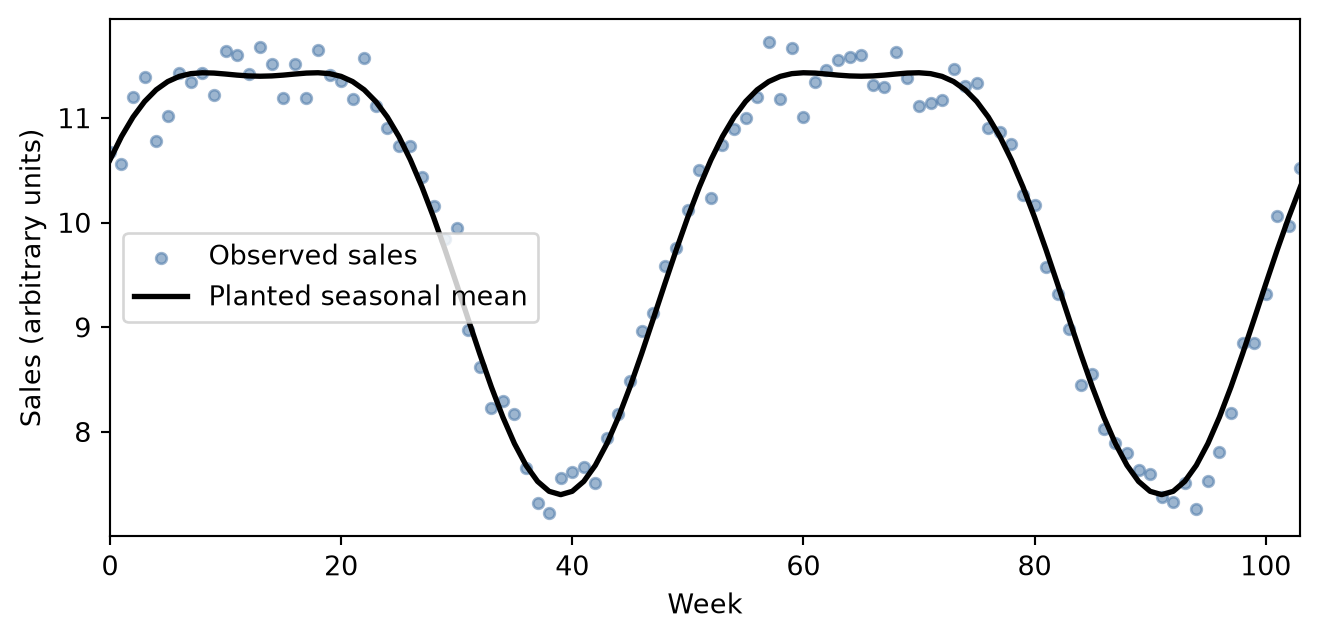
The data-generating process has a baseline of 10 sales units, a one-cycle sine wave of amplitude 2, a second harmonic of amplitude 0.6, and Gaussian measurement noise with standard deviation 0.25. We simulate two full 52-week cycles so that the model sees the repetition it must learn.
Figure 1: Simulated weekly sales across two 52-week cycles. Points include Gaussian observation noise; the solid line is the planted seasonal mean in sales units.
The points are noisy, but the rise and fall repeat after 52 weeks. The model below has enough harmonics to recover both the broad annual wave and the smaller second-harmonic feature without fitting a separate effect for every week.
Fit a Fourier seasonal model
model = pathmc.model("sales ~ fourier(week, n=3, period=52)", data=df)model.equations()
The Fourier term owns six coefficients: one sine and one cosine weight for each of the three harmonics. These weights jointly describe the shape of the cycle, while the equation intercept describes the overall sales level.
Initializing NUTS using jitter+adapt_diag...
Sequential sampling (1 chains in 1 job)
NUTS: [beta_fourier_sales_week, beta_sales, sigma_sales]
Sampling 1 chain for 200 tune and 200 draw iterations (200 + 200 draws total) took 0 seconds.
Only one chain was sampled, this makes it impossible to run some convergence checks
Check posterior-predictive sales
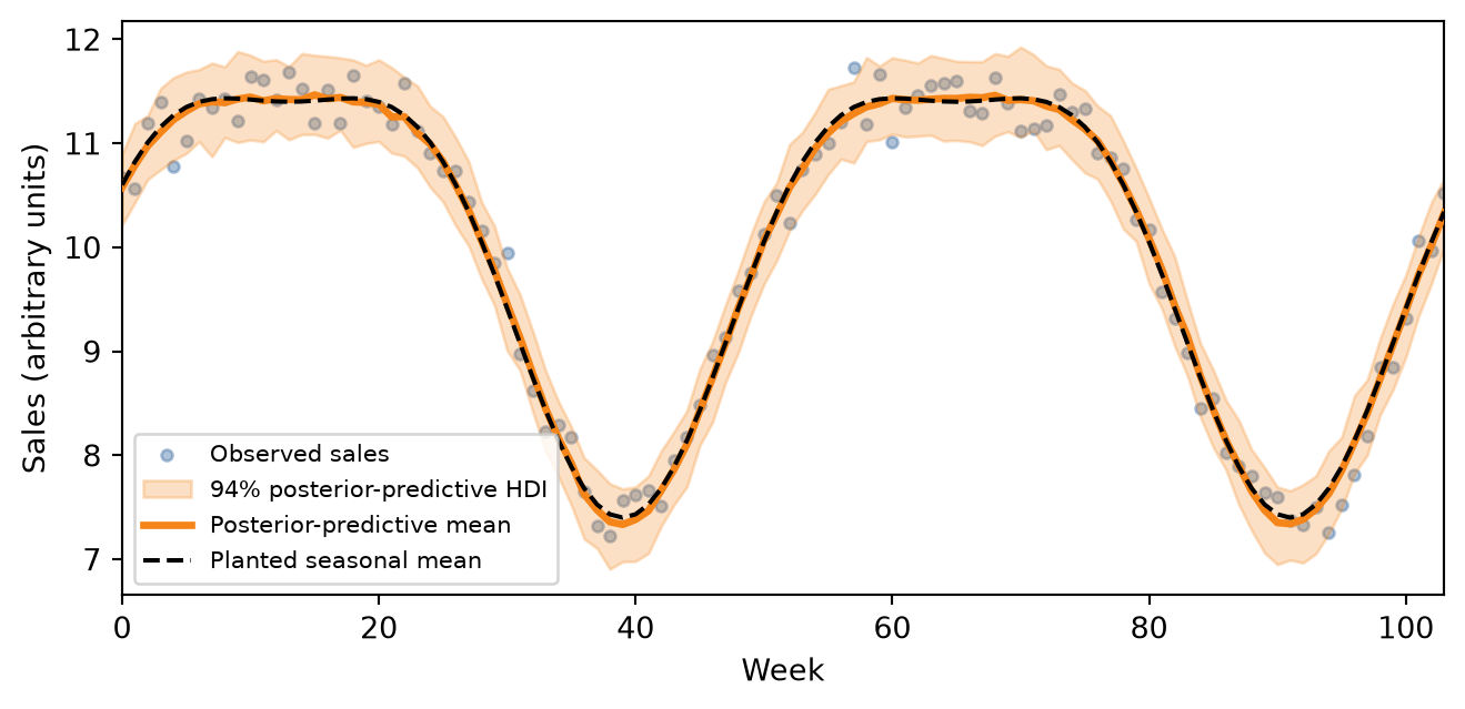
A fitted seasonal curve alone would hide the uncertainty introduced by residual noise. A posterior predictive check instead simulates new sales at every observed week, combining uncertainty about the harmonic weights with the model’s observation noise.
Figure 2: Posterior-predictive weekly sales with a 94% HDI across two 52-week cycles. The black dashed curve is the planted seasonal mean; points are the simulated observations in sales units.
The posterior-predictive mean follows the planted seasonal mean, and the 94% interval covers the scatter expected from the simulated observation noise. That is the relevant check here: the model should recover the repeating pattern without pretending that an individual week’s sales are known exactly.
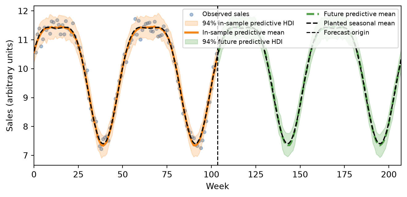
Fourier columns are recomputed when their input changes. We can therefore intervene on the next two 52-week cycles without an HSGP-style fitted support boundary. To make the future interval comparable with the in-sample interval above, we request kind="predictive": both panels then include uncertainty in the harmonic weights and residual sales noise.
The projection lies outside the fitted numerical range, so pathmc emits one extrapolation warning. That warning is useful context; Fourier remains defined here because its period specifies how the basis repeats beyond the observed weeks.
/var/folders/r0/nf1kgxsx6zx3rw16xc3wnnzr0000gn/T/ipykernel_68743/363643189.py:2: UserWarning: Intervention value [104.00, 207.00] for 'week' is outside the observed data range [0.00, 103.00]. Results are extrapolations and should be interpreted with caution.
  future_predictive = model.do(set={"week": future_week}, kind="predictive")
Sampling: [sales]
future_predictive retains posterior-predictive samples for every future week. The collapsed cell below turns those samples into the figure’s means and 94% intervals.
Figure 3: In-sample and future posterior-predictive weekly sales. Orange marks the fitted 104 weeks and green marks two future 52-week cycles; both bands are 94% HDIs for individual sales observations. The black dashed curve is the planted seasonal mean in sales units.
The orange and green bands now describe the same quantity: plausible individual sales observations, not just the model’s expected curve. The forecast does not become artificially narrow at week 104; any remaining difference reflects what the model learned about the repeating pattern, not omitted residual noise. In applied work the dashed reference will be unavailable, but the predictive band still communicates uncertainty about future observations.
Takeaway: use fourier() when the outcome varies smoothly and periodically, use a posterior predictive check to assess observations, and use do() to project the expected cycle at future input values. For a smooth relationship that does not repeat, see the HSGP example.